Summer Language Institute card
|
Description
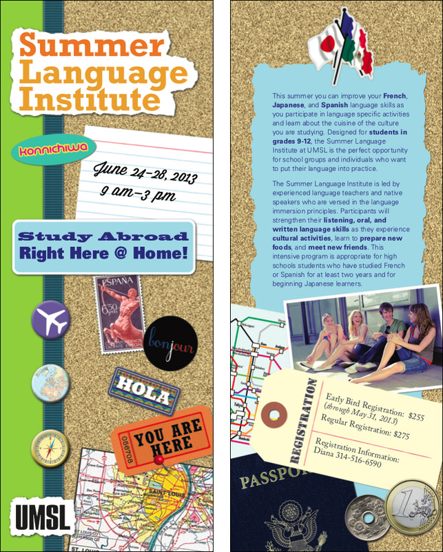
4⅛ x 11, 4 color, on card stock Produced in Adobe Illustrator Images edited and prepared in Adobe Photoshop Role Designer Objective A brochure to go directly to high school students, to advertise a summer language camp Process For this new language and culture camp, the client asked for a brochure with "bright colors and pictures of high school students having fun." It was soon evident that there wasn't enough content–just a few paragraphs–for a brochure. I suggested a card instead and the client agreed. We chose a size that would still fit their brochure stand and #10 envelopes. The client also suggested a passport theme but thinking about the audience–high school students–and knowing the popularity at the time of the new Smash scrapbooks, I presented this idea in draft form. The client loved it! I created the stickers and buttons related to language and travel in Photoshop as well as scanning or creating associated ephemera–maps, tickets, coins–on the theme. Since it was a new program, there was no existing photography and not much budgeted for stock, but I sourced one appropriate photo to give students an entry to see themselves at the camp. |
Front and back
|

|

|

|